In today’s data-driven retail landscape, rapid access to clear, actionable insights is just as critical as a flawless customer experience on the shop floor. While Solestyles Boutique’s Canvas App empowers front-line staff and the Model-Driven App guides back-office workflows, neither can surface high-level trends or forecast demand on its own. Enter Power BI: Microsoft’s flagship analytics platform that transforms raw data into rich, interactive dashboards.
Solestyles Boutique has grown from a single shop on West Yorkshire high street to a multi-channel retailer juggling in-store sales, weekend pop-ups and an online storefront. Yet when management needed to answer simple questions:
- “Which collection is underperforming this week?” or
- “How many black loafers remain in Stock?”
they found themselves cobbling together Excel exports and lists, with data often days out of date. Decisions made on stale figures carried real risks:
- Stockouts
- Missed promotions, and
- Overstretched cash flow
To close this gap, Power BI was introduced as the central analytics layer feeding the low-code power platform.
Why Power BI for Solestyles? Because:
- Seamless Dataverse Integration – The Canvas and Model-Driven apps already write every sale, stock adjustment and customer interaction into Dataverse. Power BI connects natively via DirectQuery for live views or import mode with incremental refresh for a single source of truth.
- Tailored Refresh Measurement – Whether triggering hourly imports in Premium capacity or employing DirectQuery for near real-time stock levels, refresh schedules were configured that match Solestyles’ operational tempo – no more end-of-day surprises.
- Rich, Interactive Visuals – Beyond static tables, intuitive dashboards were crafted to empower managers to spot issues before they escalate:
- Daily sales trends,
- Stock-turn rates,
- Heat maps of customer locations, and
- What-if analysis for upcoming launches
- Embedded and Accessible – Dashboards live not only in the Power BI service but are embedded directly into the Model-Driven Admin portal and surfaced in the Canvas App. Anywhere a decision is made, the latest metrics are just a tap away.
These innovations together with seamless direct connectivity to Dataverse and support for both import-mode and DirectQuery, mean that store managers, procurement leads and the executive team can all explore sales velocity, stock-turn rates and seasonal trends in real time.
In this post, I’ll dive into how Solestyles configures, models and visualises its data in Power BI, ensuring every decision is backed by the freshest possible insights. I’ll take you step by step through the:
- Connection of Power BI to Solestyles’ data,
- Modelling a star schema tailored for retail analytics,
- Writing DAX measures that capture key performance indicators, and
- Designing dashboards that keep the business agile.
By the end of this post, you’ll have a blueprint for turning raw Dataverse records into strategic insights ensuring your own personal decisions are guided by the Soulstyles experience and example information.
Connecting to Your Data Sources
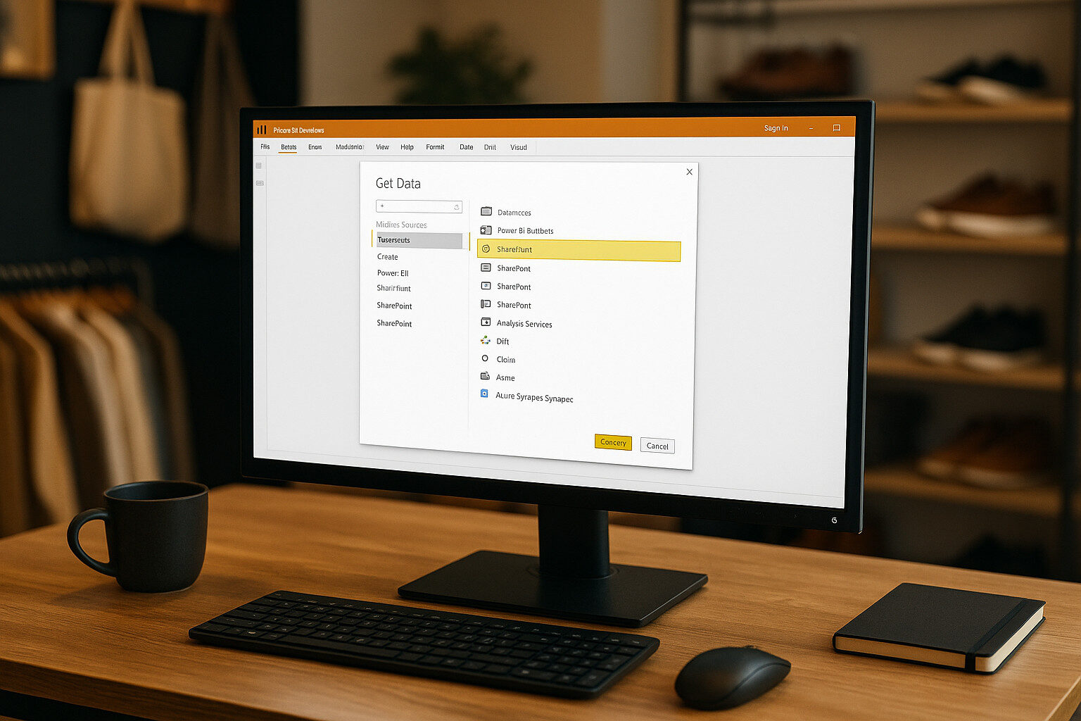 Before building your Power BI visuals, you must establish dependable, performant connections to your operational data primarily housed in Dataverse (recommended), with supplementary sources for Canvas App collections. I’ll explore the two main Dataverse methods (Connector vs OData), strategies for pulling in Canvas App data, and how to blend multiple sources with Power Query.
Dataverse Connector vs. OData Feed
Power BI Desktop offers two first-party options for Dataverse:
- Power BI Dataverse Connector
- Uses the Tabular Data Stream (TDS) protocol for both Import and DirectQuery modes.
- Recommended for most scenarios because it supports server-side filtering, relationships and choice columns natively.
- Prerequisite: The Dataverse TDS endpoint must be enabled in your environment (admin setting in the Power Platform Admin Center).
- OData Feed (Common Data Service Legacy)
- Exposes an OData v4 endpoint to query tables via HTTP GET requests.
- Best suited for small, read-only extracts or when leveraging dataflows to migrate between environments.
- Lacks full support for choice columns and can incur pagination-related performance issues on large tables.
Recommended approach: Use the Dataverse Connector in Import mode for datasets under 100 MB, switching to DirectQuery for real-time needs (e.g., live stock levels). Reserve OData for lightweight dataflows or niche migration tasks.
Importing Canvas App Collections
Your Canvas App caches critical lookup tables; example – categories, suppliers and static lists; in local collections. To mirror these in Power BI:
- Expose Collections via SharePoint or Azure Data Lake
- If a Canvas App saves collections to SharePoint lists, connect via SharePoint Online List in Power BI:
Source = SharePoint.Tables("https://yourtenant.sharepoint.com/sites/solestyles", [Implementation="2.0"])
- Alternatively, use Power Automate to write collections to an Azure Data Lake Gen2 CSV or Parquet file (large data storage option); then ingest with the Azure Data Lake Storage connector.
- Refresh Coordination
- Schedule your Power Automate flow that exports collections immediately before your Power BI dataset refresh to ensure lookup tables stay in sync with Dataverse.
Combining Multiple Sources with Power Query
Once connected, blend Dataverse tables and Canvas App collections in Power Query:
- Merge Queries
- In Power Query Editor, use Merge Queries to join fact tables (e.g., Orders) with dimension tables (Products, Contacts, colCategories).
- Query Folding
- For DirectQuery and the Dataverse Connector, ensure transformations (filters, column selections) fold back to the source to minimise client-side processing.
- Check each step’s View Native Query to confirm folding.
- Data Type & Privacy Settings
- Explicitly set column Data Types (Date, Decimal, Text) in the first transformation step to avoid errors.
- Configure Privacy Levels per source (Organizational for Dataverse, Public for Azure Data Lake) in File → Options → Privacy to prevent unnecessary data isolation throws.
Security and Governance Considerations
- Row-Level Security (RLS)
- Define RLS roles in Power BI Desktop to restrict users to their allowed data slices (e.g., managers see all regions, store staff only their own).
- Credential Management
- In the Power BI Service, store credentials in the dataset’s Data source credentials pane choosing OAuth2 for the Dataverse connector so that each user’s security roles apply at query time.
- Gateway Requirements
- For on-premises Data Lake or SharePoint data, ensure the On-Premises Data Gateway is configured in personal or standard mode, and that the service account has read access to the source.
By choosing the right Dataverse connection method, importing your Canvas collections reliably, and blending all sources in Power Query with proper folding and security settings, you establish a rock-solid data foundation.
Building a Robust Data Model
A performant, maintainable Power BI report starts with a sound data model. For Solestyles Boutique, I followed a classic star-schema approach; a central fact table for transactional data (sales, orders) surrounded by dimension tables that describe key attributes (products, customers, dates). This layout ensures fast aggregations, intuitive relationships and clear separation between metrics and filters.
Designing the Star Schema
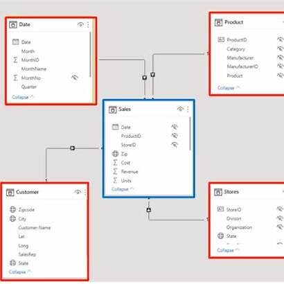
In the designed solution:
- FactSales: Contains one row per order line, with measures like Quantity, UnitPrice and LineTotal.
- DimProduct: Holds ProductID, Name, Category, Colour, Size and Collection.
- DimCustomer: Stores CustomerID, Name, Email, Region and LoyaltyTier.
- DimDate: A complete calendar table with Date, Year, Quarter, Month and IsHoliday flags.
- DimShops: Hold potential future shop (location) based data; ShopID, ShopType, etc.
Each dimension table links to FactSales via a single, one-to-many relationship on the matching key (e.g., ProductID). Cross-filtering flows from dimensions into the fact, enabling slicers and filters to work seamlessly.
Configuring Relationships & Cardinality
- Manage Relationships (Modeling → Manage relationships):
- Verify each link is one-to-many, not bi-directional.
- For DimDate, mark the “Date” column as a “Mark as date table” in Table tools ensuring full support for time-intelligence functions.
- Enforce Referential Integrity:
- Hide any orphaned foreign keys by filtering them out in Power Query avoiding unlinked rows that can affect totals.
Hiding Unused Columns & Display Folders
To streamline the field list for report authors:
- Hide technical keys and helper columns (e.g., surrogate IDs, audit timestamps).
- Display Folders: Organise fields logically (e.g., group Year, Quarter, Month under “Date Hierarchy”) via the Column tools pane.
Role-Playing Dimensions & Calculations
When the same dimension (Dim) serves multiple roles such as DimDate for OrderDate and ShipDate you can:
- Duplicate the relationship in the Model view.
- Rename the duplicate table in the Fields list (e.g., DimDate: Order, DimDate: Ship) via Manage roles.
- Use these in visuals to compare order vs shipping timelines without DAX hacks.
Best Practices for Modeling in 2025
- Prefer Import Mode with Incremental Refresh (See later section below) for large datasets, fallback to DirectQuery only for real-time needs.
- Leverage composite models: Combine Import and DirectQuery in one report to balance performance and freshness.
- Define hierarchies (Year→Month→Day) in DimDate for intuitive drill-down.
- Use descriptive table and column names – for example, prefix custom tables with Fact_ or Dim_ to sustain clarity as your model scales.
By adhering to a star-schema design and refining relationships, folders and role-playing dimensions, Solestyles’ Power BI data model became the reliable backbone for every chart, slicer and insight designed, created and deployed.
Creating Key Measures with DAX
A Power BI report lives and dies by its measures. These DAX formulas turned raw table columns into the key performance indicators managers use to steer Solestyles Boutique;
- Total Sales
- Stock Turnover
- Month-over-Month Growth and beyond.
In this section, I explore when to use measures vs calculated columns, craft the core DAX formulas, leverage time-intelligence functions and adopt best practices for readability and performance. This is a deeper dive – please skip if not interested.
Measures vs Calculated Columns
- Calculated Columns compute once at data-load, storing results row-by-row in your model. Use them for static attributes (e.g. a full product name combining brand and style).
- Measures evaluate on the fly in response to slicers, filters and visuals, returning aggregated results. All the KPIs (sums, averages and time-based comparisons) should be measures.
Total Sales
The foundation of any retail dashboard:
Total Sales = SUMX( FactSales, FactSales[Quantity] * FactSales[UnitPrice] )
- SUMX iterates over each row of FactSales, multiplying Quantity by UnitPrice.
- Use SUMX instead of two separate measures to guarantee correct context and formatting.
Stock Turnover Rate
A measure of how quickly inventory sells through:
Stock Turnover Rate = DIVIDE( [Total Sales], AVERAGE(Products[BeginningStock]), 0 )
- DIVIDE handles divide-by-zero gracefully (returning 0 if no stock).
- AVERAGE(Products[BeginningStock]) captures the typical opening stock level over the selected period.
Month-over-Month Growth
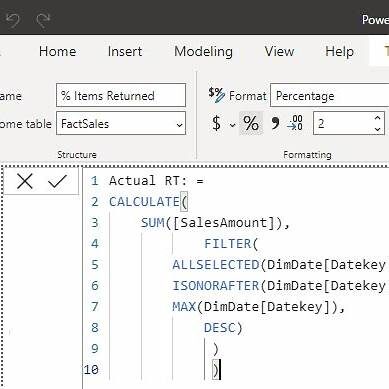 Comparing this month’s sales to last month’s:
MoM Sales Growth % = VAR Current = [Total Sales] VAR Prior = CALCULATE( [Total Sales], DATEADD(DimDate[Date], -1, MONTH) ) RETURN IF( ISBLANK(Prior), BLANK(), DIVIDE(Current - Prior, Prior) )
- DATEADD shifts the filter context back one month.
- ISBLANK prevents showing a percent change when there’s no prior period to compare.
Time-Intelligence Functions
Power BI’s built-in functions simplify common patterns:
- TOTALYTD:
Sales YTD = TOTALYTD( [Total Sales], DimDate[Date], "03/31" // fiscal year end )
- SAMEPERIODLASTYEAR:
Sales LY = CALCULATE( [Total Sales], SAMEPERIODLASTYEAR(DimDate[Date]) )
Ensure DimDate is marked as a date table (Modeling → Mark as date table) to unlock full time-intelligence support.
Best Practices
- Use Variables (VAR) to store intermediate results improving readability and performance.
- Minimise Row Context: Default to filter-aware measures (SUM, AVERAGE) where possible; reserve iterators (e.g. SUMX) for calculations that must evaluate row-by-row.
- Descriptive Names: Prefix measures by domain (e.g., Sales_MoM_Growth), and include units (_£K or _Pct) if helpful.
- Measure Tables: Create a dedicated table (e.g., Measures) to house all measures—kept invisible in relationships—to keep your model tidy.
- Test in Visuals: Always validate a new measure in a simple table visual before embedding in complex dashboards.
Designing Visually Compelling Reports
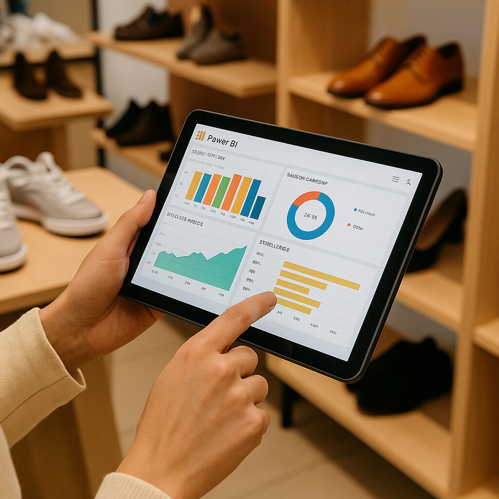
 The power of your BI model lies in how effectively it’s presented. Solestyles Boutique needed dashboards that not only render key metrics at a glance but invite exploration; whether a store manager on a tablet or the CEO at a desktop. Here’s how these requirements translated the measures into immersive, interactive reports.
Selecting the Right Visuals
- KPI Cards
- Highlight absolute figures (Total Sales, Stock Turnover Rate) with large fonts and trend arrows.
- Use KPI visuals that compare against targets or prior periods.
- Bar & Column Charts
- Ideal for categorical comparisons (sales by category, monthly revenue).
- Enable Data Labels and hover tooltips for precise values.
- Line & Area Charts
- Show trends over time (daily footfall, week-over-week growth).
- Use Small multiples in Premium to compare multiple metrics on a single canvas.
- Matrix & Tables
- Display detailed breakdowns (Top 10 products by sales, customer order history).
- Include conditional formatting (e.g., highlight low-stock items in red).
- Maps & Heat Maps
- When geography matters, plot customer locations or pop-up event performance.
- Use the Azure Maps visual for seamless geospatial rendering.
Interactive Filtering & Drill-Through Options
- Slicers
- Add slicers for Date, Category and Region.
- Sync slicers across pages (right-click → Sync slicers) so selections persist throughout the report.
- Drill-Through Pages
- Configure a dedicated “Product Detail” page: right-click on a product bar → Drill through.
- Include product image, inventory trend and related orders.
- Cross-Highlighting
- Enable interactions so selecting a segment in one visual filters all others—letting managers isolate issues in seconds.
Bookmarks & Report Storytelling Types
- Bookmarks
- Capture specific filter states or visual configurations (e.g., “Black Loafers Understocked”).
- Add a Bookmark Navigator for users to jump between predefined scenarios.
- Selection Pane
- Control the visibility of visuals for cohort-specific views (e.g., show/hide promotional banners).
- Buttons & Actions
- Assign Bookmark actions to buttons labelled “View Low Stock” or “Seasonal Trends”.
- Use Back buttons (action: Back) to return users to summary pages.
Applying Corporate Theme JSON
Maintain brand consistency by loading a JSON theme:
{ "name": "SoleStylesBrand", "dataColors": ["#2C2A29","#D4A373","#F4E1D2","#888888","#444444"], "background": "#ffffff", "foreground": "#333333", "tableAccent": "#D4A373" }
- In Power BI Desktop: View → Themes → Browse for themes and import the JSON.
- All visuals, slicers and cards adopt the brand palette automatically.
Accessibility & Mobile Optimisation
To ensure everything meets the best practices and (often forgotten) to maintain (and deliver high-end) Accessibility requirements always consider the following:
- Alt Text: Provide descriptive alt text for every visual in Format → General → Alt Text.
- High Contrast: Test in View → Show as high-contrast mode to ensure readability.
- Touch Targets: Increase slicer and button sizes for easy tapping on tablets.
- Mobile Layout: Use the Mobile layout view to customise how visuals stack on phone screens.
By combining carefully chosen visuals, interactive filters, narrative bookmarks and a consistent corporate theme, Solestyles Boutique’s Power BI reports become more than dashboards; they’re decision-making workspaces. Note! for assistance looking at Theme branding/colours I use:
Performance Optimisation, Refresh Strategies & Scheduling
Ensuring that Solestyles Boutique’s Power BI dashboards remained both fast and fresh required a multi-pronged approach. In this section, I cover how to optimise your model(s) for performance, configure scheduled and incremental refreshes, support real-time data scenarios and monitor refresh health; all using the latest Power BI capabilities (Updated June 2025).
Performance Optimisation Strategies
 When considering the best strategy for ensuring performance optimisation meets and (ideally exceeds) expectations, consider the following:
- Import vs DirectQuery vs Composite Models
- Import Mode caches data in-memory for the fastest visual performance.
- DirectQuery leaves data in Dataverse, offering live queries at the cost of extra round-trips.
- Composite Models let you mix Import and DirectQuery in a single report; e.g. transactional FactSales in Import, but live Products.InStock in DirectQuery.
- Query Folding
- Push transformations (filters, column selections) back to Dataverse by using supported Power Query steps ensuring heavy lifting happens server-side.
- Aggregations
- Pre-aggregate large fact tables at coarser grain (e.g. daily/monthly) in an Aggregations table, speeding queries that don’t need row-level detail.
- Model Simplification
- Hide unused columns and tables, disable auto-date tables when you supply a custom DimDate, and organise fields into display folders, reducing metadata bloat and UI clutter.
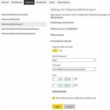
Refresh Mechanisms & Scheduled Refresh
When and how to refresh your Power BI dashboards with data?
- Import-Mode Scheduled Refresh
- Power BI Pro (shared capacity): up to 8 refreshes per day.
- Power BI Premium (per capacity): up to 48 refreshes per day; XMLA endpoint clients can execute unlimited refreshes programmatically.
- Configure in the Service under Datasets → Settings → Scheduled refresh; toggle Keep your data up to date, choose frequency (daily/hourly), time zone, and set failure notification recipients.
- Incremental Refresh
- Define RangeStart and RangeEnd parameters in Power Query, then in the dataset’s Incremental refresh settings, specify how much history to load (e.g. 5 years) and how much to refresh each run (e.g. last 1 month).
- This partitions your data, so daily refreshes only process the newest partitions reducing refresh time from hours to minutes.
Real-Time Data Techniques
All businesses would love “real time” analytics, but this often comes at a cost and a hinderance. Consider the following options:
- DirectQuery for Near Real-Time
- Ideal for critical metrics like InStock levels that must reflect live sales.
Beware: each visual interaction translates to a Dataverse query, so limit visuals or use aggregations to reduce load.
- Streaming & Push Datasets
- Use Streaming datasets or Push datasets when you need sub-minute updates e.g. a live stock ticker on your retail dashboard.
- Power Automate flows can call the Power BI REST API to push new records into these datasets, instantly refreshing visuals without a full model reload.
Monitoring & Data Alerts
All cloud-based applications, whether OOTB or custom developed require a level of monitoring and alerts to ensure security, compliance and data protection is maintained, but also for any issues that may be causing functionality to be failing. To ensure this, the following best practices were deployed to Solestyles boutique Power BI functionality:
- Refresh History & Alerts
- In the Power BI Service, each dataset shows its last 28 days of refreshes with statuses (Success/Warning/Error). Configure Failure notifications to alert dataset owners or distribution lists.
- Tile-Based Data Alerts
- On key visuals (e.g. AvailableStock card), click the ellipsis → Manage alerts, set thresholds (e.g. below 10), and choose notification channels (email, mobile) keeping managers a step ahead of stock-outs.
- Capacity & Performance Monitoring
- For Premium tenants, use the Premium Capacity Metrics app to track refresh durations, memory usage and query times; identify bottlenecks before they impact end users.
Embedding & Distribution
 To make analytics truly actionable, Solestyles Boutique embeds Power BI reports and dashboards directly into the apps and portals the team uses every day ensuring insights are always within arm’s reach. So how do you pin visuals into Model-Driven dashboards,? The details below (I hope) will guide you on surfacing tiles in Canvas Apps, managing distribution through the Power BI Service, and enforcing Row-Level Security for data governance.
Pinning Reports to Model-Driven Dashboards
- Create a Power BI Dashboard
- From your report in the Power BI Service, hover over a visual and click the Pin visual icon.
- Choose an existing dashboard (e.g. Solestyles Admin Dashboard) or create a new one.
- Embed Dashboard in Model-Driven App
- In the Power Apps Maker Portal, open Solestyles Boutique solution and edit your Model-Driven App.
- Click + Component → Dashboard and select Power BI dashboard.
- Choose your workspace and dashboard; tiles appear natively in the app’s home area for immediate manager access.
Surfacing Tiles in Canvas Apps
- Add Power BI Tile Control
- In Power Apps Studio, open your Canvas App and go to Insert → Charts → Power BI tile.
- Bind the control to your Workspace, Dashboard, and Tile name.
- Dynamic Tile Selection
- Use variables or user context to switch between tiles (e.g. store-level vs regional KPIs):
pbitWorkspace = "SolestylesRetail" pbitDashboard = If(varUserRegion="North","NorthRegionDashboard","AllStoresDashboard") pbitTile = "AvailableStock"
- Seamless UX
- Place the tile alongside other Canvas screens (e.g. on the Home page), so shop managers see critical metrics without switching apps.
Publishing & Sharing via Power BI Service
- Workspaces & Apps
- Organise reports into a Solestyles Analytics workspace.
- Bundle dashboards into a Power BI App, assigning it to user groups (e.g. Sales Managers, Procurement).
- Sharing Settings
- Grant Read or Build permissions at the workspace level for collaborative editing.
- For external partners, use Secure Embed links or Publish to web with caution.
Note! consider Power Pages for authenticated portal scenarios as an option (see Part 7 in the series).
Row-Level Security (RLS)
- Define Roles in Desktop
- In Power BI Desktop’s Modeling → Manage roles, create roles (e.g. Region North, Region South) with DAX filters:
[Region] = "North"
- Validate with View As
- Test each role via Modeling → View as Roles to confirm the correct data slices.
- Assign Roles in Service
- After publishing, open the dataset in the Service, go to Security, and add users or Entra ID groups to each role.
This ensures each user sees only the data they’re authorised to view; crucial for maintaining customer privacy and competitive edge.
Best Practices
- Consistent Naming: Prefix dashboards and tiles (db_SalesOverview, tile_StockLevel) to simplify binding in apps.
- Use Dashboards Sparingly: Pin only your highest-priority visuals; too many tiles can overwhelm both performance and user focus.
- Automate App Updates: When dashboards change, republish your Power BI App so users immediately see the newest content.
- Monitor Usage: In the Power BI Service, review workspace and app usage metrics to retire underused reports and refine distribution.
Governance & Lifecycle Management
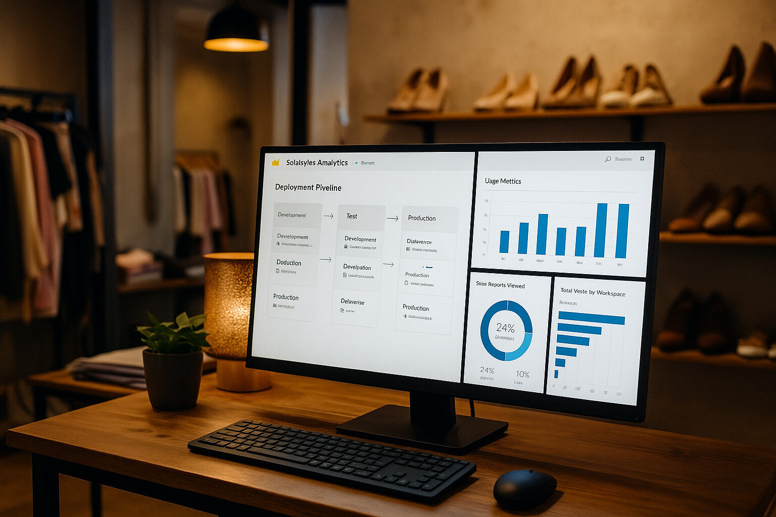 As Solestyles Boutique’s analytics footprint grows, so does the need for disciplined control over report development, deployment and usage. As I draw close to the end of this deep dive post I’ll show you how to version and promote Power BI artifacts via Deployment Pipelines, monitor dataset health and adoption in the Power BI Admin Portal, and leverage the Center of Excellence (CoE) Starter Kit to enforce organisational standards.
Versioning & Deployment Pipelines
Deployment Pipelines allow you to move content; datasets, reports and dashboards; safely (between workspaces) from Development → Test → Production, with validation steps at each stage.
- Create a Pipeline
- In the Power BI Service, navigate to Deployment pipelines → Create pipeline.
- Name it Solestyles Analytics Pipeline, assign to your workspace trio (Dev/Test/Prod).
- Assign Content
- Drag your “Solestyles Sales” dataset and reports into the Development stage.
- Click Deploy to push to Test, then validate visuals and data before the final Deploy to Production.
- Compare & Validate
- Use the View differences pane to compare schema changes, report layouts or connection strings between stages.
- Fix any discrepancies in Dev, then re-deploy ensuring Test and Prod stay in sync.
- Automated Pipeline Triggers
- Integrate with Azure DevOps/GitHub Actions using the Power BI REST API:
POST https://api.powerbi.com/v1.0/myorg/deploymentpipelines/{pipelineId}/stages/{stageId}/deploy
Authorization: Bearer <token>
Content-Type: application/json
{
"sourceWorkspaceId": "<DevWorkspaceId>", "destinationWorkspaceId": "<TestWorkspaceId>"
}
- This enables CI/CD for your reports, reducing manual steps and release risk.
Monitoring in the Power BI Admin Portal
The Admin Portal provides tenant-wide usage and refresh metrics:
- Usage Metrics
- Under Usage metrics → Reports usage you can see:
- Report views by user and workspace
- Average time spent on each page
- Most and least accessed reports
- Refresh History & Failures
- In Datasets → Scheduled refresh you can review:
- Last refresh status and duration
- Failure reasons and email alerts sent
- Configure Data flow refresh monitoring similarly
- Audit Logs
- Enable Power BI activity log in the Office 365 Security & Compliance center to track who viewed, exported or shared each report; vital for compliance and security investigations.
Center of Excellence (CoE) Starter Kit
Microsoft’s CoE Starter Kit provides a governance dashboard and automation to enforce standards – a must have kit:
- Install the CoE Solution
- Add the CoE Core Components solution from AppSource into your tenant.
- Adoption & Inventory Dashboards
- Out-of-the-box reports show active makers, new flows, datasets with stale refreshes and non-compliant connectors.
- Policy Remediation
- Use the CoE Admin | DLP dashboard to identify and quarantine reports or dataflows that violate your Data Loss Prevention policies.
- Custom Rules
- Extend CoE with Power Automate flows that disable or notify on workspace names that don’t follow standards (e.g., prefix “Sol_” for all workspaces).
Best Practices Recap
- One Pipeline, Three Stages: Always develop in Dev, validate in Test, then promote to Prod.
- Automate with REST: Script deployments to eliminate manual errors.
- Monitor Proactively: Set up alerts on refresh failures and adoption dips.
- Enforce with CoE: Leverage starter kits to apply naming, retention and DLP policies at scale.
By embedding these governance and lifecycle practices, Solestyles Boutique now ensures its analytics remain reliable, secure and aligned with evolving business needs no matter how large the data or how frequent the updates.
Conclusion & Next Steps
 We’ve now navigated the entire Power BI journey for Solestyles Boutique—from connecting live data and crafting a flexible star schema, to writing DAX measures, designing interactive dashboards and embedding reports across apps. Along the way, we covered performance tuning, refresh scheduling and governance patterns that keep your analytics both speedy and reliable.
Design Patterns & Best Practices Summary
Throughout this series, I have explored how to build a comprehensive analytics solution for Solestyles Boutique and now offer some guiding principles and repeatable patterns that make Power BI models and reports both robust and maintainable ensuring your work scales with the business and remains easy to update.
Naming Conventions & Folder Structures
- Table & Measure Prefixes
- Prefix fact tables with Fact_ and dimensions with Dim_ (e.g. Fact_Sales, Dim_Product).
- Namespace measures by domain: Sales_Total, Inventory_Turnover.
- Display Folders
- Group related fields and measures in folders (e.g. “Time Intelligence”, “Sales KPIs”) via the Model view—keeping the Fields list tidy.
Accessibility & Inclusivity
- Alt Text:
- Every visual must include descriptive alt text (Format → General → Alt text), aiding screen-reader users.
- High-Contrast Themes:
- Test your report in View → Show as → High contrast. Ensure text, data labels and chart elements remain legible.
- Keyboard Navigation:
- Use simple, logical tab orders. Avoid overly complex visuals that trap keyboard focus.
Documentation & Data Lineage
- Data Dictionary:
- Maintain a separate page or hidden “Documentation” table listing each column, its source, calculation logic and intended use.
- Query Comments:
- In Power Query, add comments to complex transformation steps explaining why data is filtered, pivoted or merged.
- Version Notes:
- In the Power BI Service dataset settings, update the Description field with release date, author and high-level change summary.
Modular Report Design
- Template Pages:
- Create a “Base Layout” report with branded header, footer and slicer panel. Duplicate this page for new report sections to ensure consistency.
- Reusable Visuals:
- Save common chart configurations (colours, data-label settings) as a custom theme JSON.
- Measure Table:
- House all DAX measures in a dedicated “Measures” table (hidden from relationships) to separate logic from data.
Performance-First Mindset
- Monitor with Performance Analyzer
- Use View → Performance analyzer in Power BI Desktop to capture slow visuals and optimize DAX or data granularity.
- Composite Models & Aggregations
- Blend DirectQuery and Import, and define aggregation tables for common high-level queries balancing freshness with speed.
Design Patterns for Scalability
- Composite Models
- Partition your model: keep high-volume historical data in Import, use DirectQuery for live inventory metrics.
• Incremental Refresh - Define time-based partitions (e.g. last 1 month refresh, 5 years static) to ensure nightly refreshes complete within SLAs.
- Streaming Tiles
- For critical “hot” metrics, push updates to a Streaming dataset and surface them as live tiles in your reports or apps.
By embedding these naming standards, accessibility checks, documentation practices and performance-first patterns into your Power BI development lifecycle, you will ensure your analytics remain accurate, inclusive and lightning-fast – no matter how large the dataset or complex the requirements.
Key outcomes:
- A data model optimised for retail KPIs, with clear dimension tables and fact relationships.
- Measures that translate raw transactions into actionable insights; Total Sales, Stock Turnover Rate and Month-over-Month Growth.
- Dashboards designed for every audience: quick KPI cards for the shop floor, deep drill-through pages for analysts, and embedded tiles in both Canvas and Model-Driven apps.
- A refresh strategy that balances import-mode, incremental and real-time techniques to ensure your metrics never lag behind operations.
- Governance and lifecycle controls; deployment pipelines, CoE monitoring and naming conventions that protect and streamline your BI estate.
Final words
Thank you for joining this deep dive into Power BI analytics. Your feedback and success stories help shape future posts; please drop a comment below or fill in the contact me form. I look forward to diving into the next part with you.